Lean Program Identity / Brinks
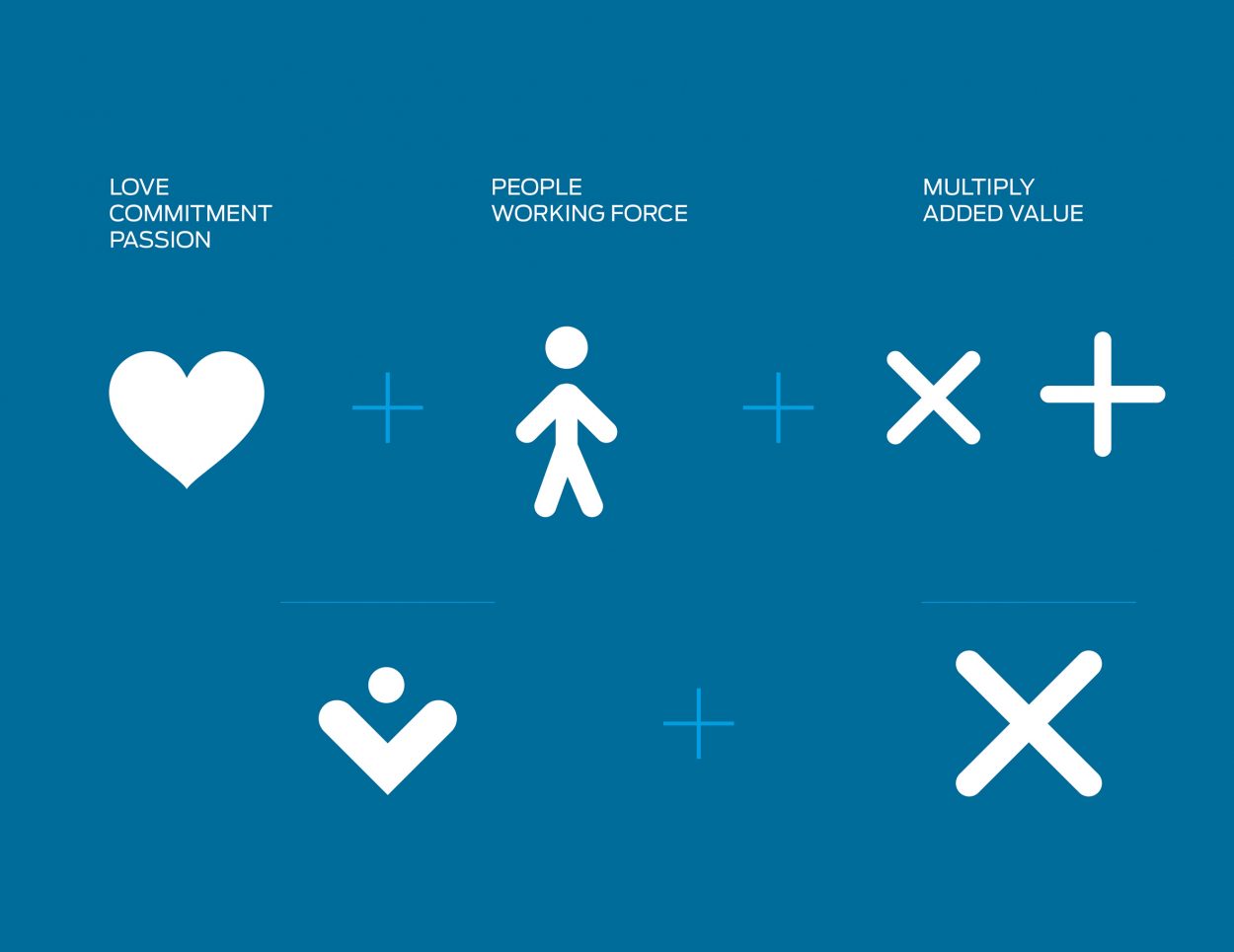
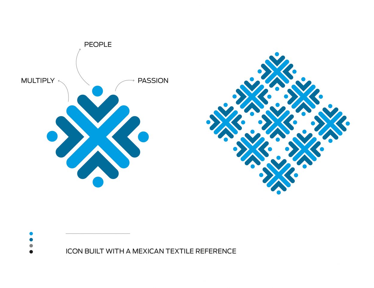
Lean is a corporate communication program of Brinks (Servicio PanAmericano) in Mexico’s office. The program is centered on the added value employees can give to the services provided by the company to their clients. With that in mind, the studio worked with the ”Multiplying Our Value” concept. The visual concept was based on: 1) Heart, passion and commitment of the employees (people/working force). 2) The added value through the multiply and addition symbol. 3) The program needed a local reference, so we got inspired by Mexican textiles having the possibility of making a pattern if needed in any application. The blue colors were in reference to having a fresh perspective and linked to the company’s color palette.
Brand design / Visual communication / Logotype


