Daniel Esqueda Design

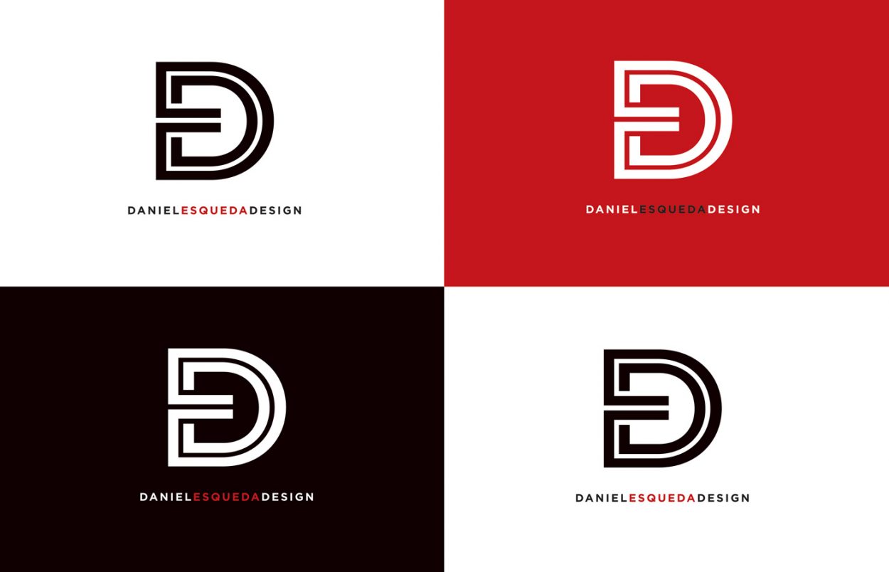
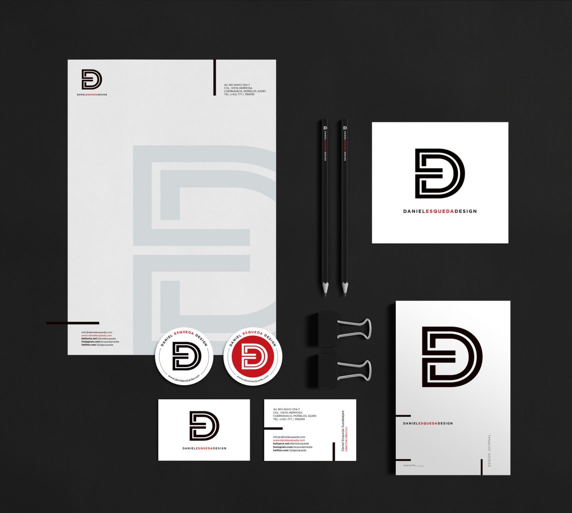
We refreshed our identity in order to present a proposal that expresses more the integration and could be handled as a monogram. Based upon the first letters of the studio’s name, we wanted to form a single element that would be felt connected in just one line. The colors black, red and white of the original identity were kept. The result: a simple and powerful monogram that could be used in any application.

Privacy Settings
We use cookies to enhance your experience while using our website. If you are using our Services via a browser you can restrict, block or remove cookies through your web browser settings. We also use content and scripts from third parties that may use tracking technologies. You can selectively provide your consent below to allow such third party embeds. For complete information about the cookies we use, data we collect and how we process them, please check our Privacy Policy
Youtube
Consent to display content from - Youtube
Vimeo
Consent to display content from - Vimeo
Google Maps
Consent to display content from - Google