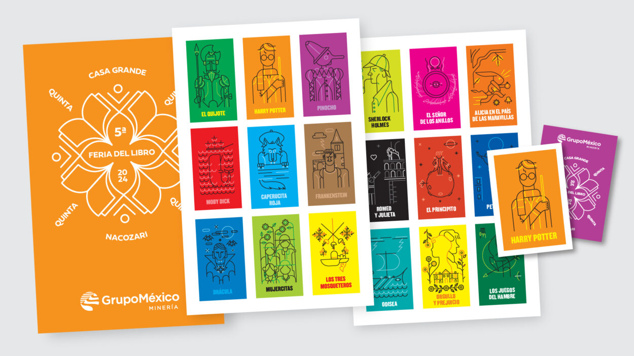
Nacozari Book Fair Visual Identity
Nacozari, a small mining town nestled in the northern Mexican state of Sonora, hosts an annual book fair that celebrates the joy of reading and writing. For the 5th edition of this much-anticipated community event, the organizers sought to create a fresh and engaging visual identity that would capture the spirit of the occasion.
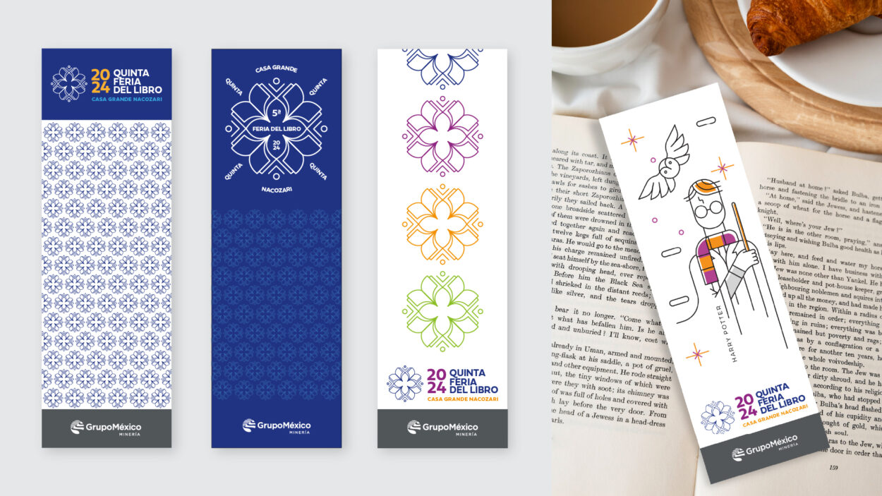
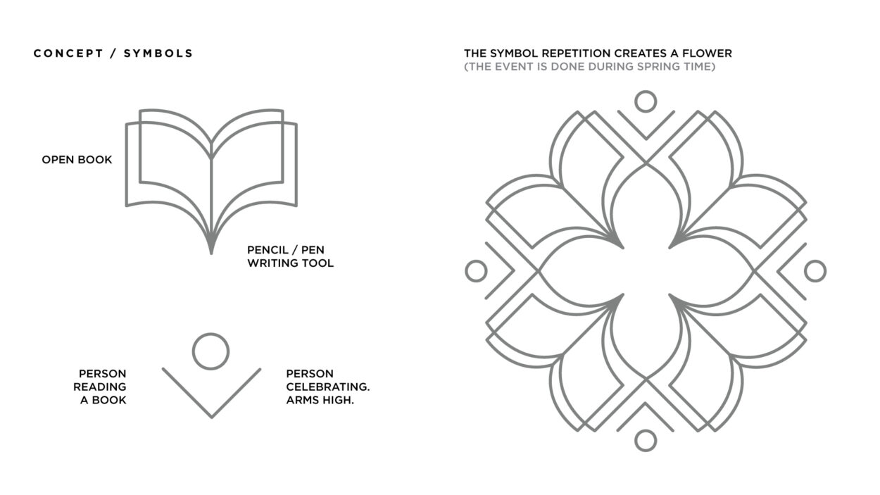
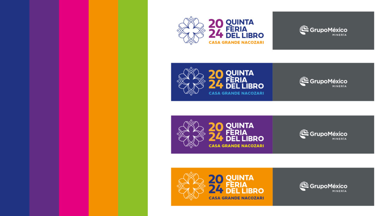
Inspired by the simple pleasures of books and the written word, we developed a concept that revolved around three fundamental elements: a book, a writing tool, and a person, representing the reader-writer dynamic. The repetition of these symbols within the design formed a flower-like motif, symbolizing the springtime setting in which the book fair takes place.
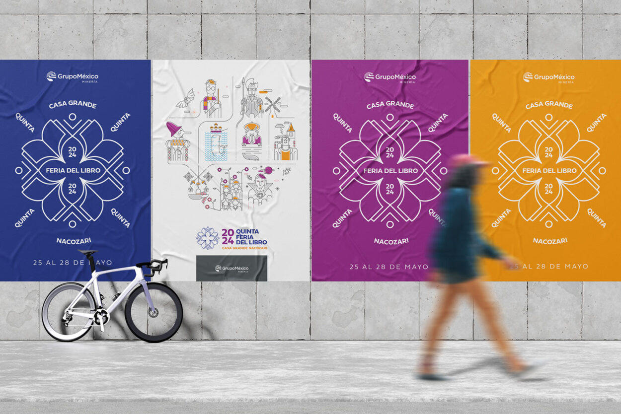
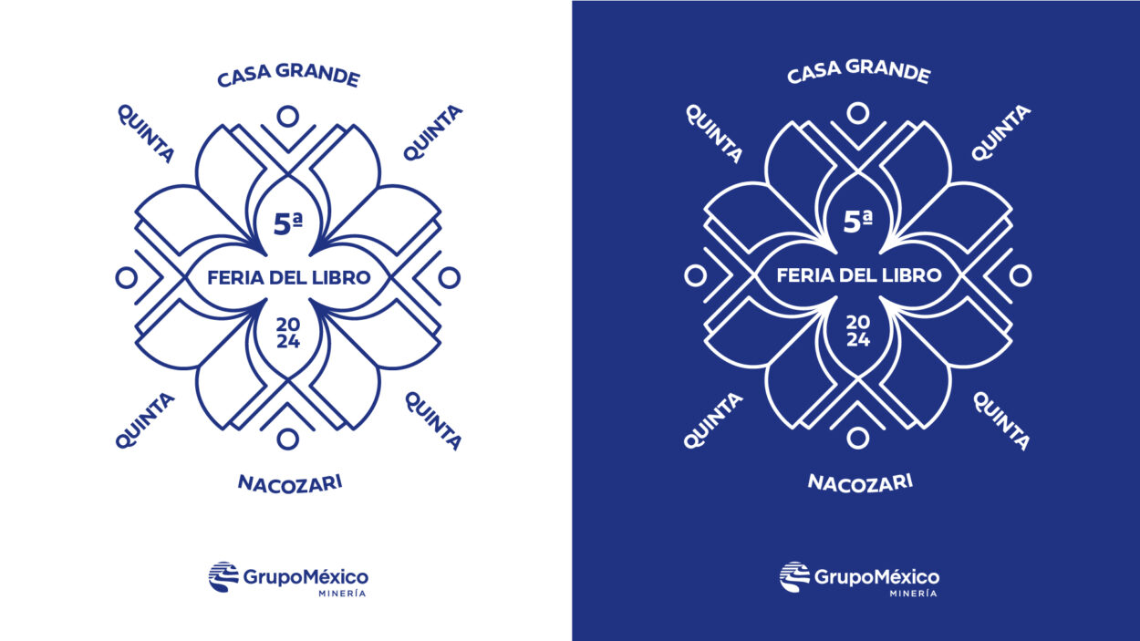
This icon, the centerpiece of the visual identity, was crafted with a linear, minimalist aesthetic, making it easy to read and adapt to various applications, whether in vibrant colors or stark white. The design team curated a palette of five vivid colors to bring the identity to life, infuse it with a sense of energy and vibrancy.
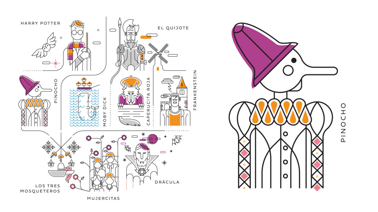
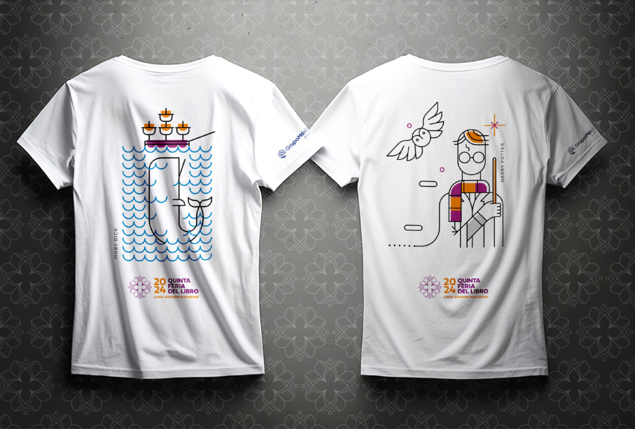
To further engage the younger attendees, the studio commissioned Mexican illustrator Oldemar Gonzalez to create a series of charming book character illustrations. These whimsical depictions, rendered in the same graphic style as the primary identity, would be featured prominently on posters, t-shirts, and the traditional Mexican “loteria” board game, which would be integrated into the book fair’s programming to foster a sense of community and playfulness.
The result was a cohesive and captivating visual identity that seamlessly blended the love of reading and writing with the vibrant cultural tapestry of Nacozari. Through the strategic use of symbolism, color, and illustration, a crafted visual language that would resonate with book lovers of all ages was developed, drawing them in and igniting their enthusiasm for the 5th Fair Book.
Client: Grupo Mexico / Community Development
Design: Daniel Esqueda Design
Illustrations: Oldemar Gonzalez
