Brand architecture / Mosaicos Venecianos de Mexico
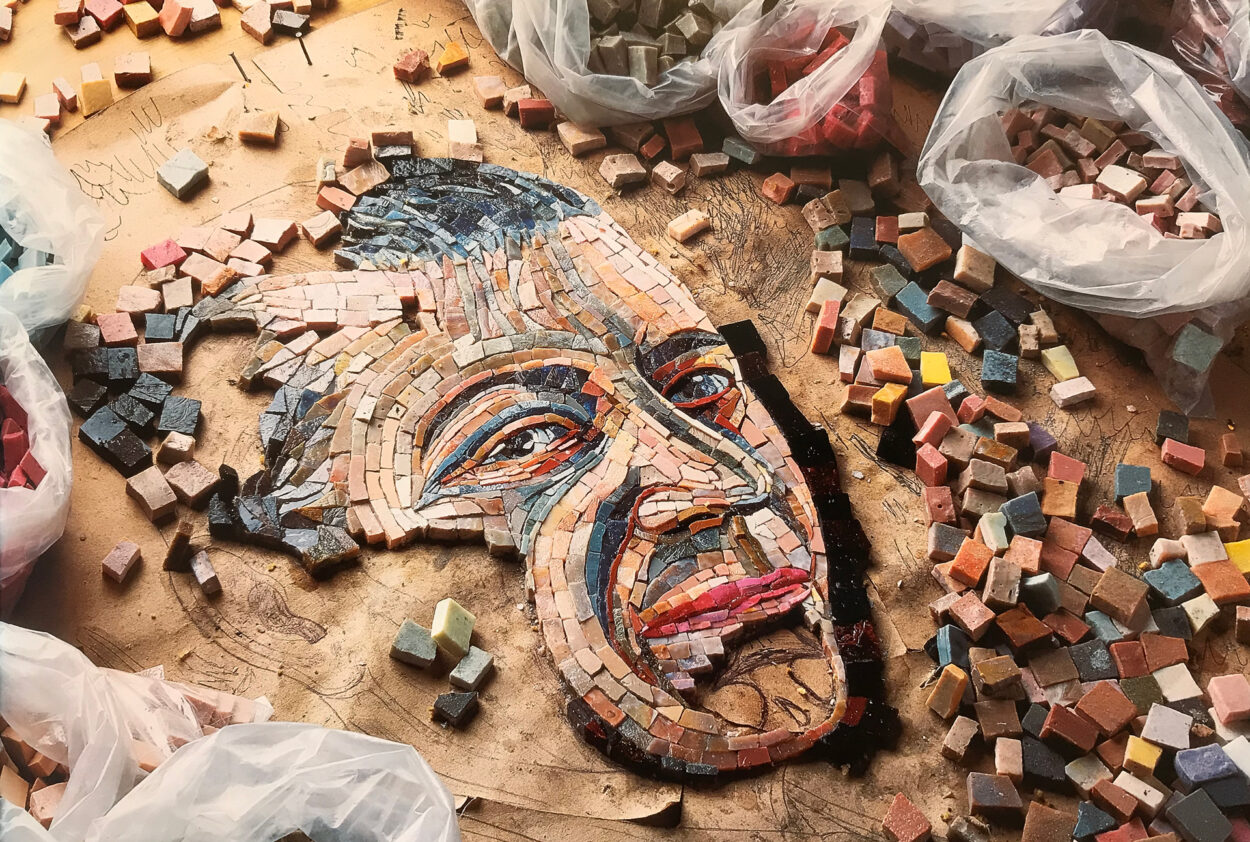
For the past 70+ years, Mosaicos Venecianos de Mexico has used its history to craft intricate murals, pools, and outdoor spaces all over Mexico and the globe. Mosaicos Venecianos de Mexico needed to establish a new brand architecture to align its brand with its strategic objectives. This new identity showcases a strong connection between the holding company and its product brands while incorporating innovation, art, culture, and technology to benefit its clients.
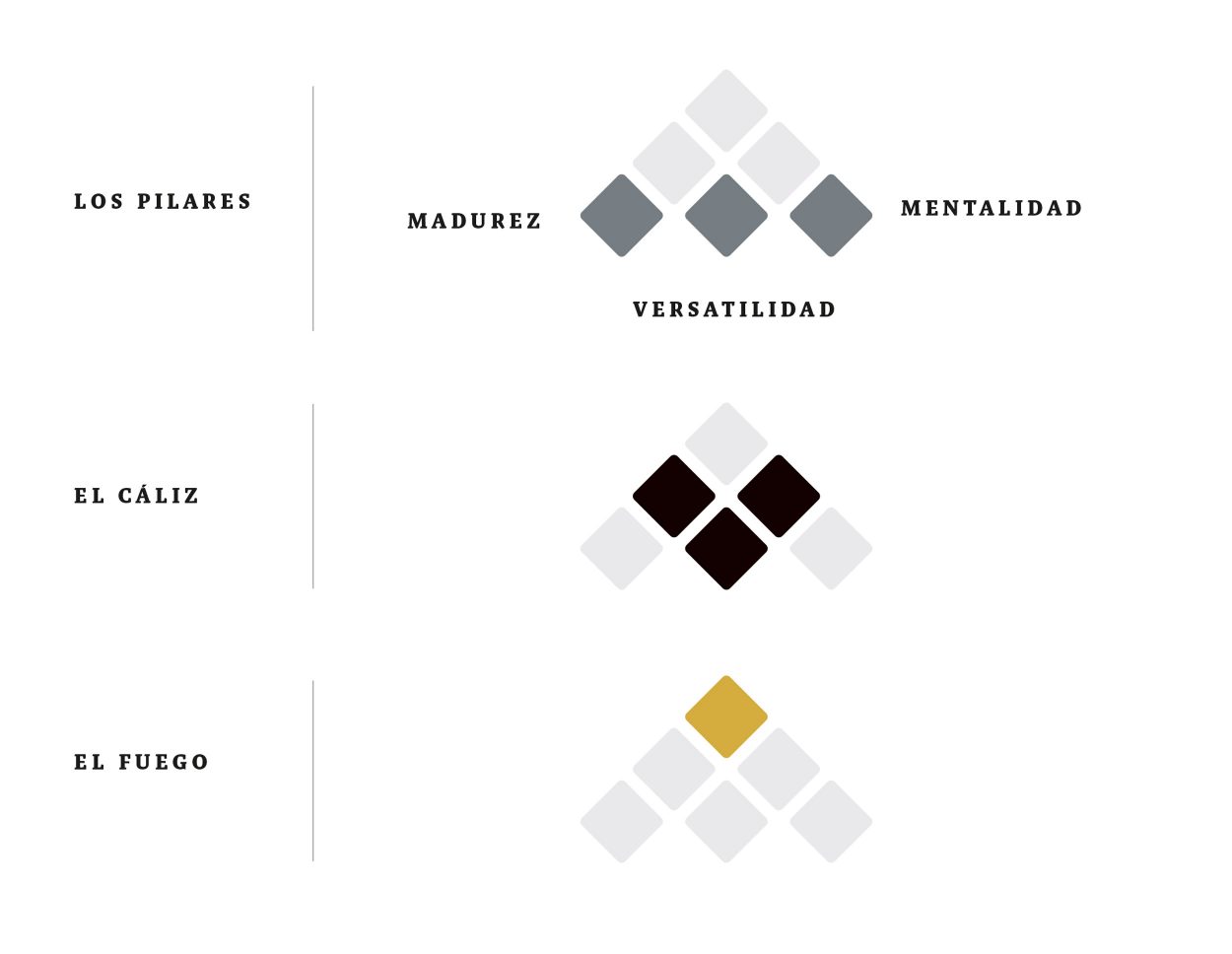
With the client, we defined the strategic pillars for the holding company (Mosaicos Venecianos de México). From there, we conceptualized the elements that integrated the process of making tiles: fire and the goblet. Fire metaphorically represents the passion of the family and employees for making great things, while the goblet represents the experience that holds the craftsmanship of their art.
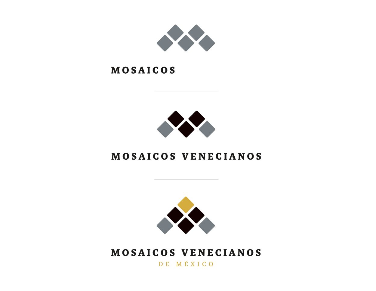
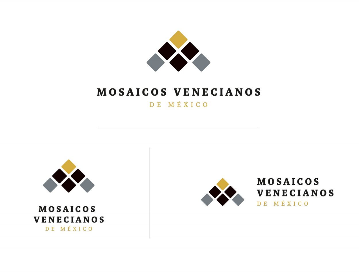
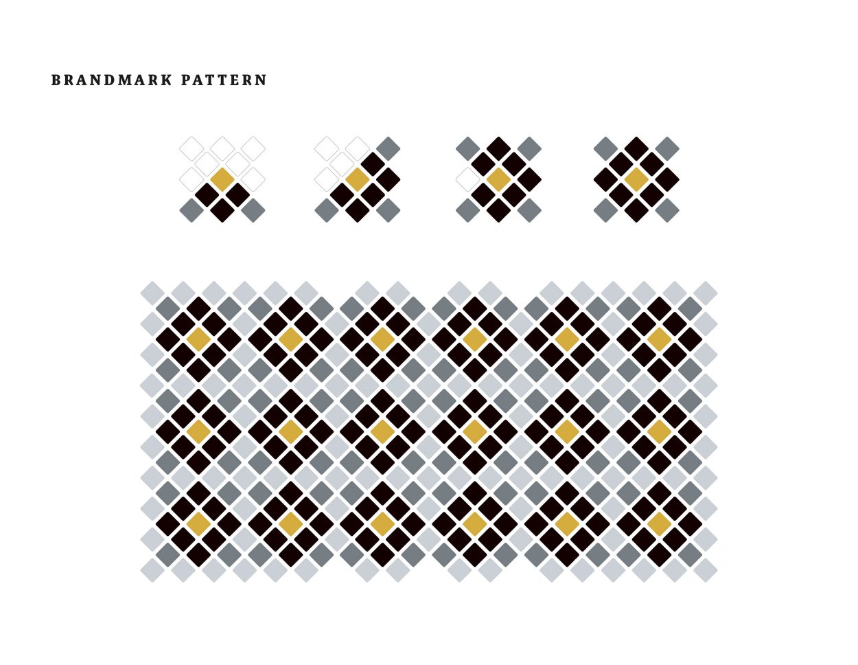
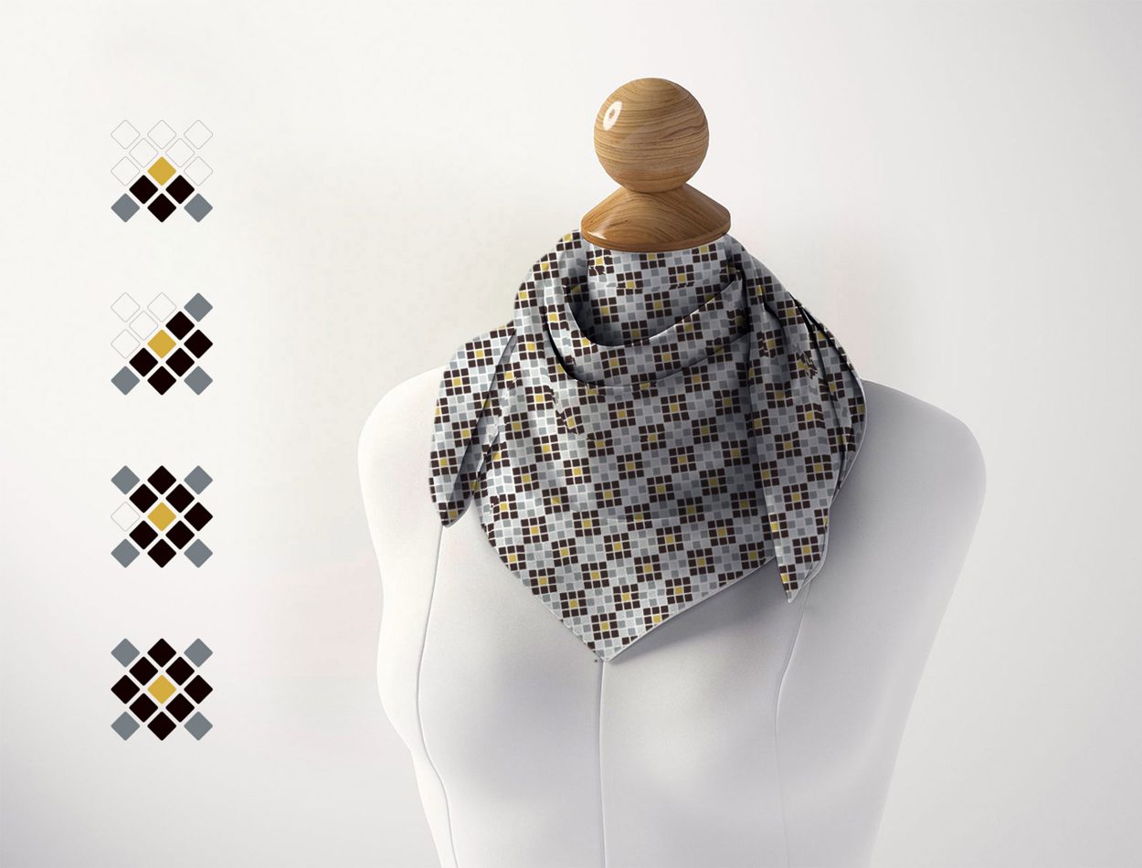
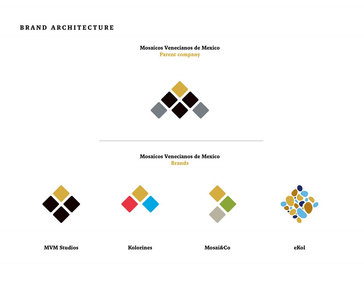
This tile’s identity serves as a foundation for creating individual elements for each brand as part of a new brand structure. The visual identity was designed with vibrant colors, geometric shapes, and bold typography to create a unified look for the brands.
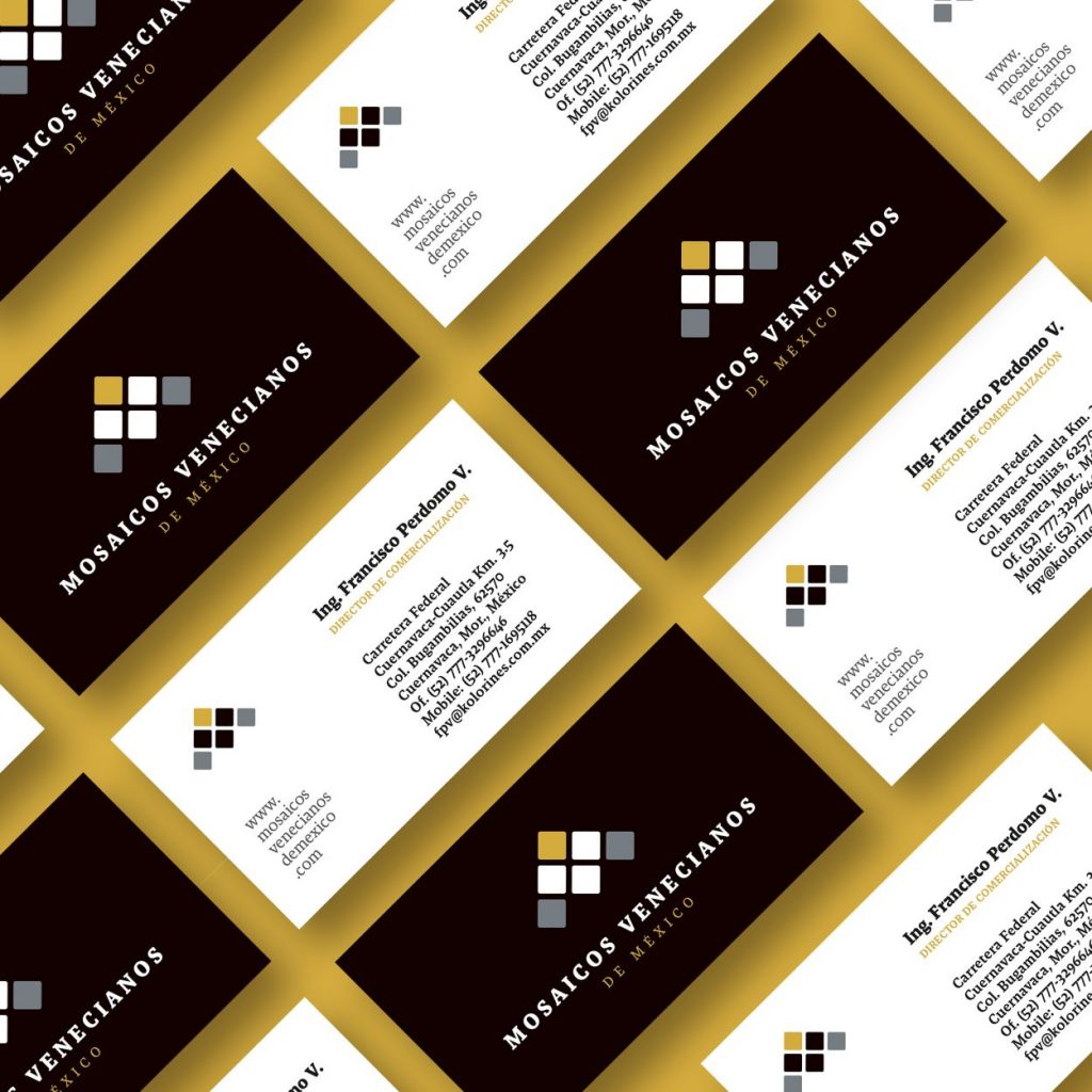
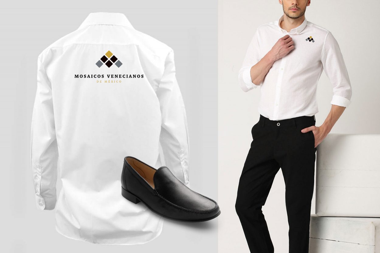
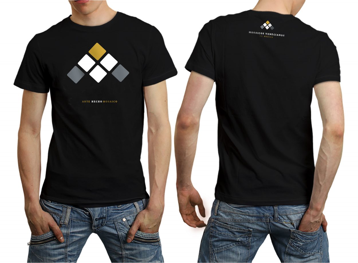
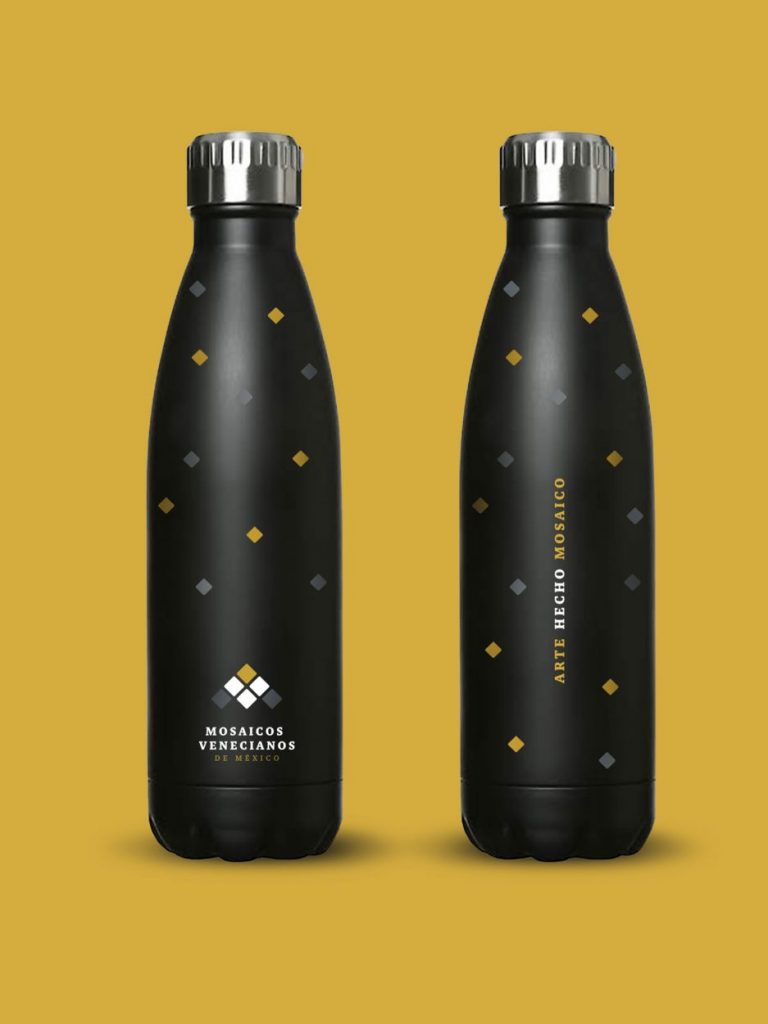
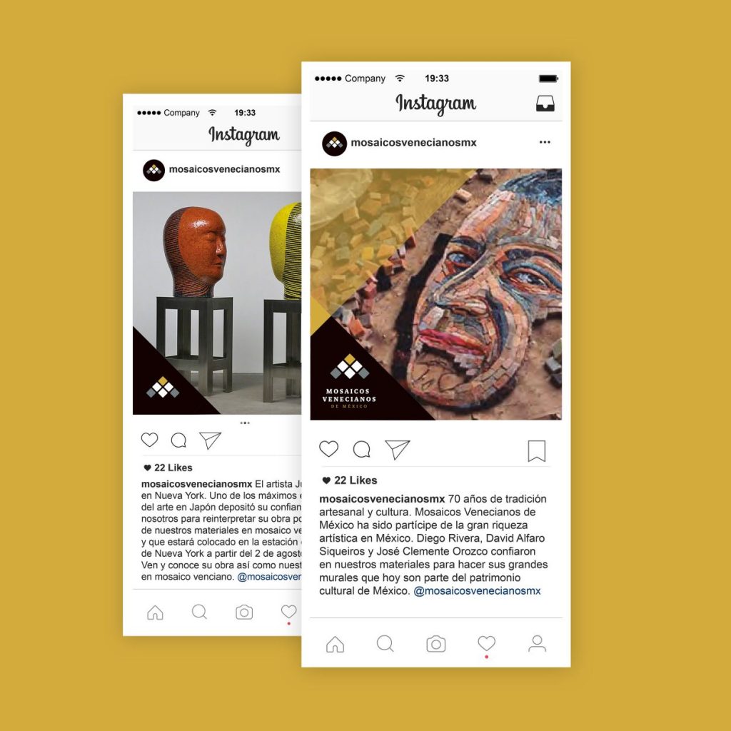
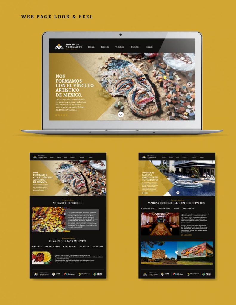
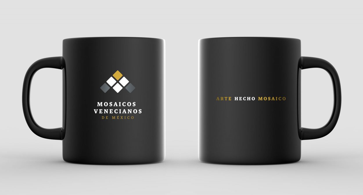
The new brand identity was designed to be flexible and recognizable, and it was adapted to be used in different materials such as digital applications, print, packaging, and signage. By creating a new brand architecture, Mosaicos Venecianos de Mexico created a unified visual identity that reflects their commitment to craftsmanship, sustainability, and innovation. The result is a vibrant, modern, and cohesive brand to help the company reach its strategic objectives.
MVM Studio, Kolorines, ekol, and Mosai&Co brands were all given a new appearance based on the graphic origin that inspired Mosaicos Venecianos de Mexico.
Branding / Brand Architecture / Identity
Category
