Daniel Esqueda Design
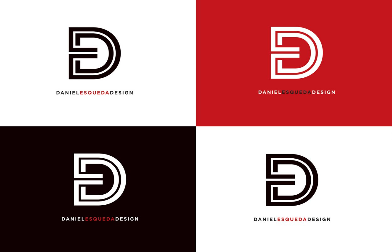
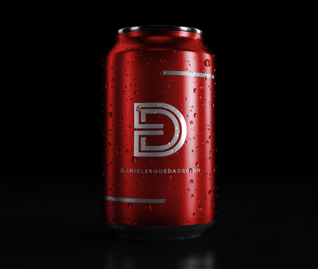
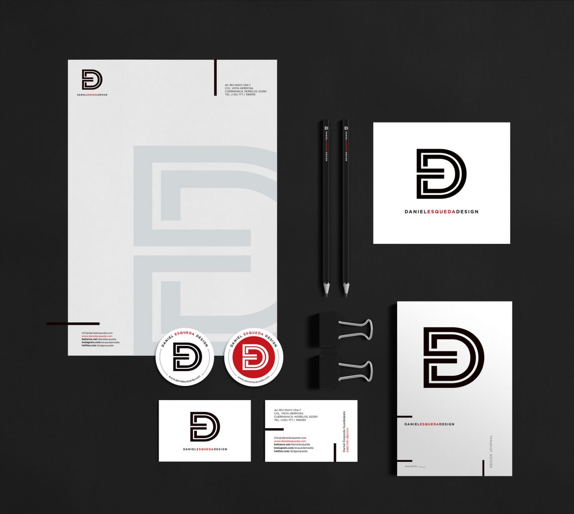
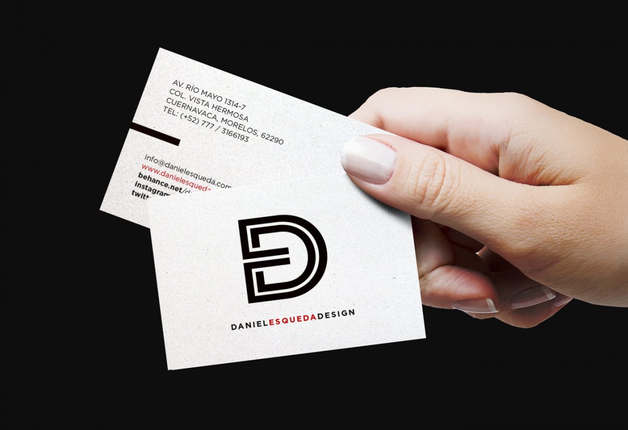
We refreshed our identity in order to present a proposal that expresses more the integration and could be handled as a monogram. Based upon the first letters of the studio’s name, we wanted to form a single element that would be felt connected in just one line. The colors black, red and white of the original identity were kept. The result: a simple and powerful monogram that could be used in any application.
Category