Golf&Spa Website
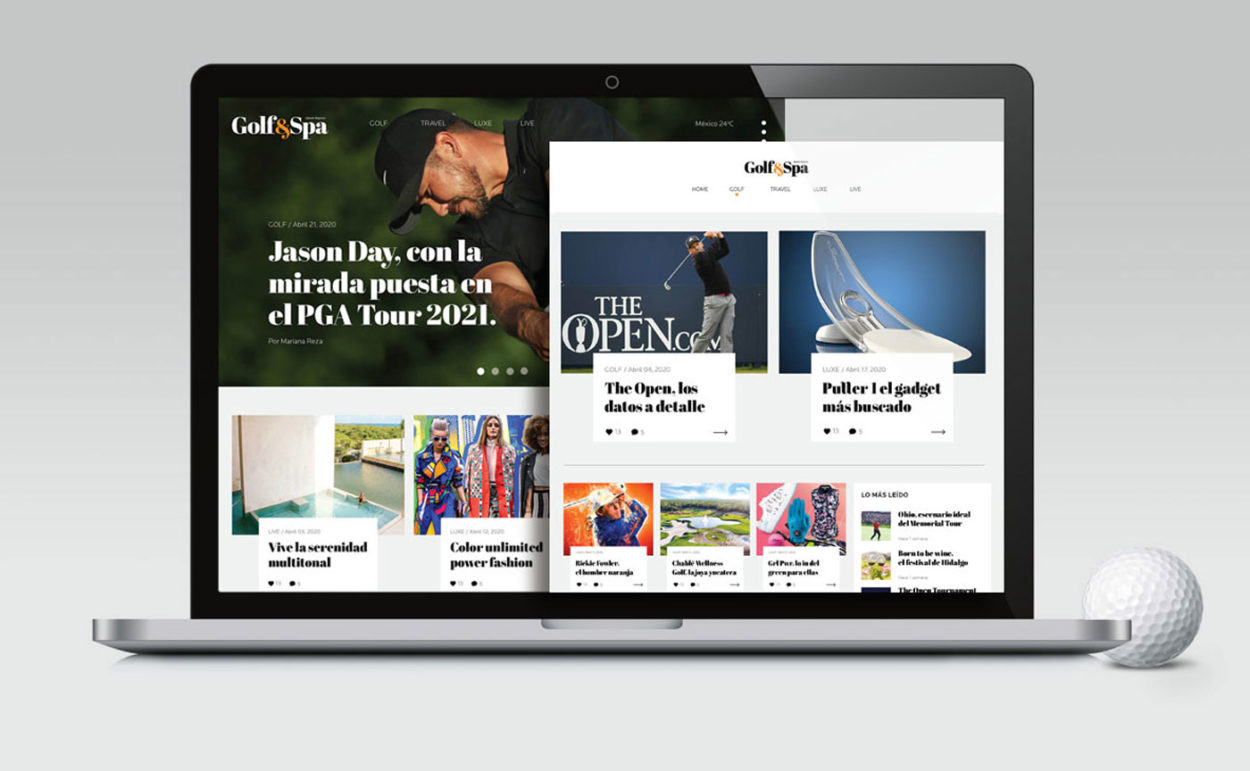
The decision to revamp the Golf & Spa website stemmed from the desire to optimize its content, enhance its identity system, and visually enrich the information. Leveraging the user-friendly WordPress system, a design framework was implemented to establish content hierarchy. This allowed for the incorporation of established print formats such as graphics, boxes, and infographics, but in a digital context.
To streamline the development of visual proposals, pre-designed layout formats were created in accordance with clear content guidelines. These formats enabled easy modification or adaptation without increasing the complexity of the content or compromising the graphic-informative aspects. Consequently, styles for various content elements (headings, intros, text types, highlights, boxes, etc.) were devised, along with a color palette for different sections.
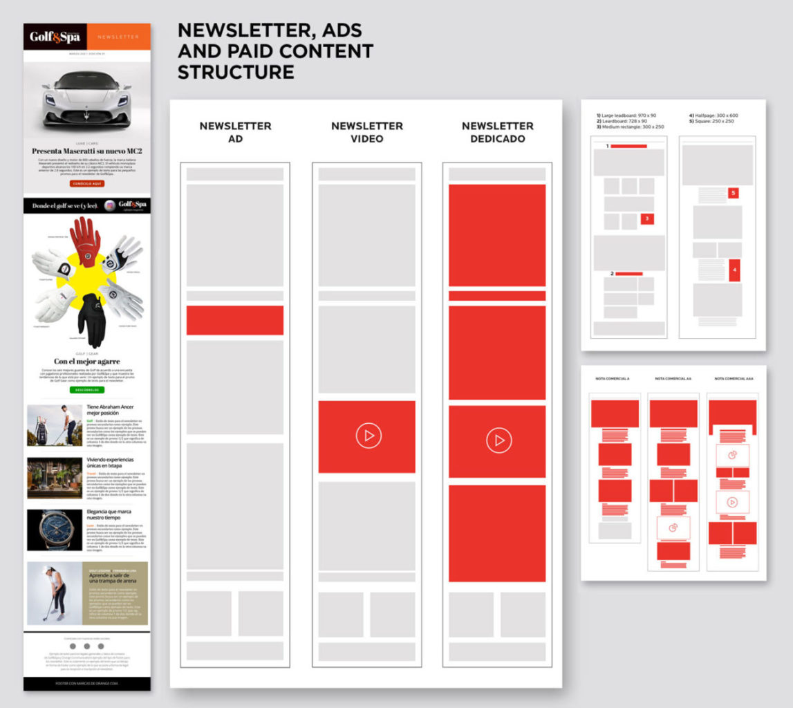
In addition, the ad formats for the website were determined, as well as a clear presentation method for paid or sponsored content to ensure transparency for readers. A newsletter format was also designed, taking into account potential commercial spaces it could feature.
Design / Art Director: Daniel Esqueda, Heriberto Borja. Editor / Mariana R. Fuentes
Category
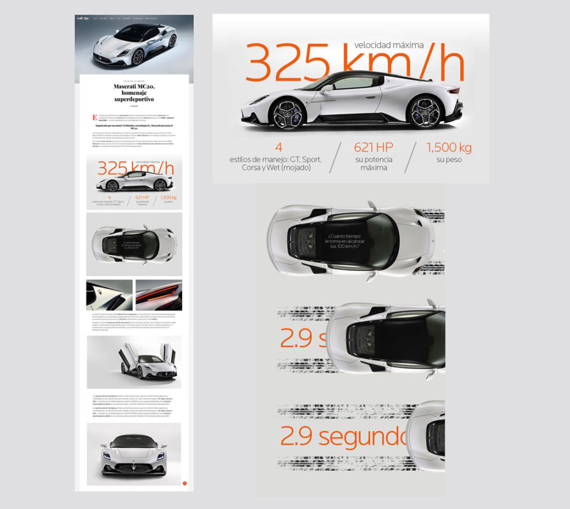
Data visualization and some motion graphics are used through out the content creating entertaining reading experiences.
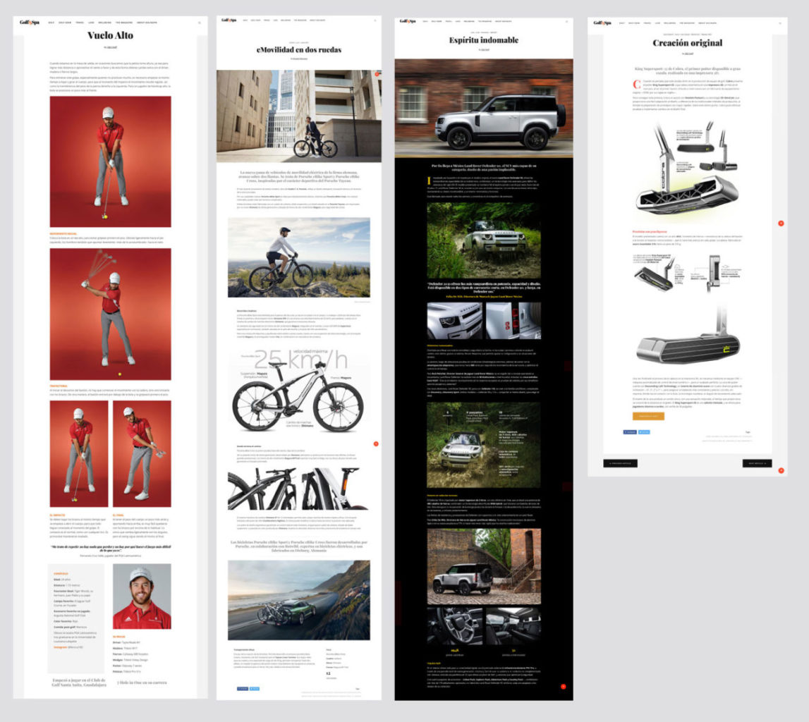
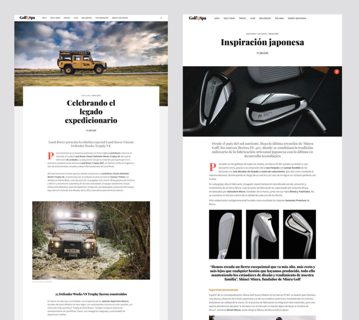
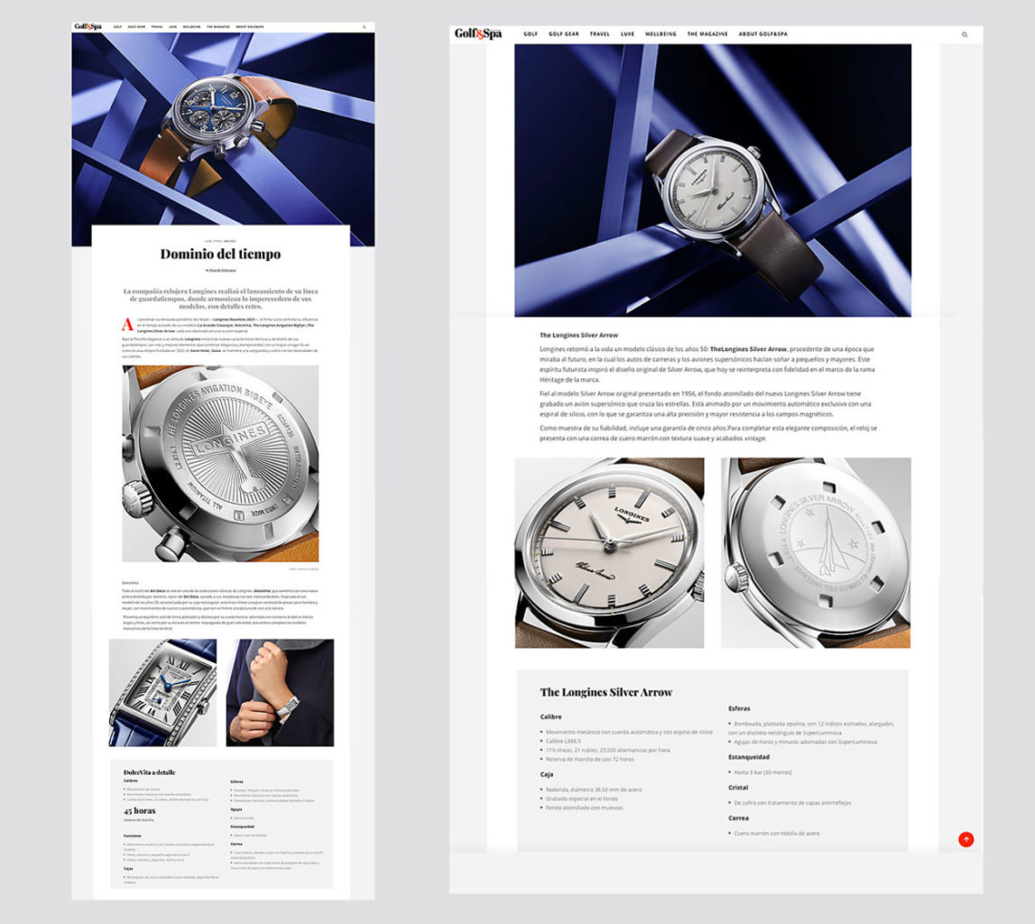
By establishing hierarchy and different content levels we were able to create better reading experiences for the audience.
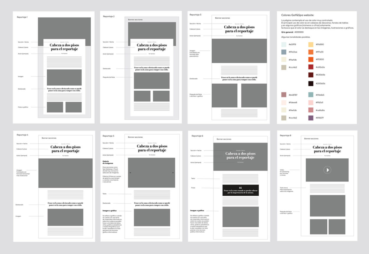
Taking advantage of the WordPress system we created a series of pre-designed layouts for the team to work with, making it easier to modify once they stablished the kind of content and visual information they will be working with (graphics, video, motion graphics, images, etc.).
