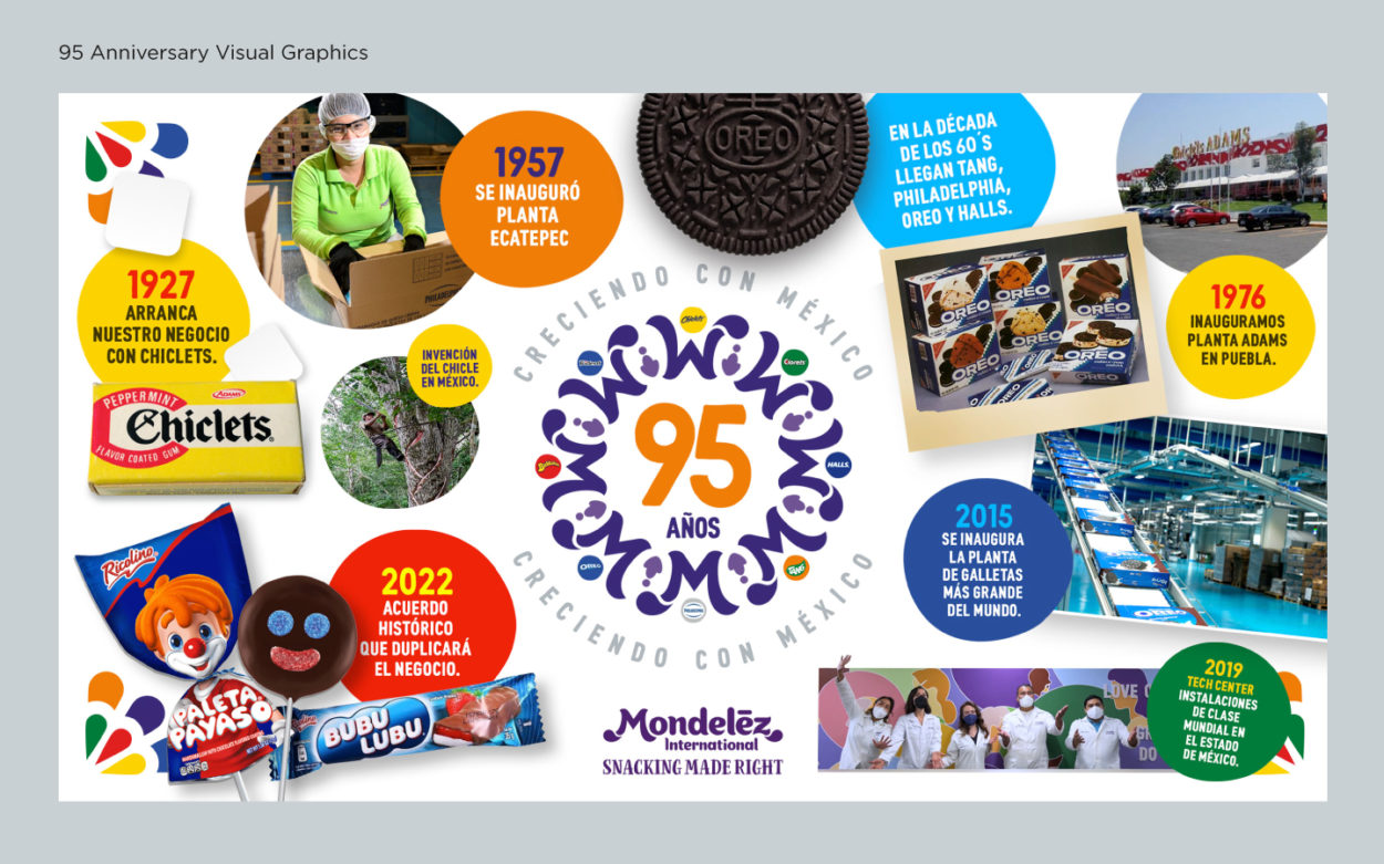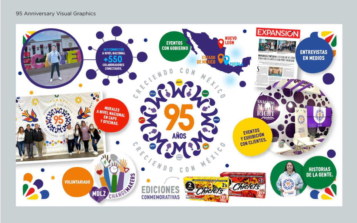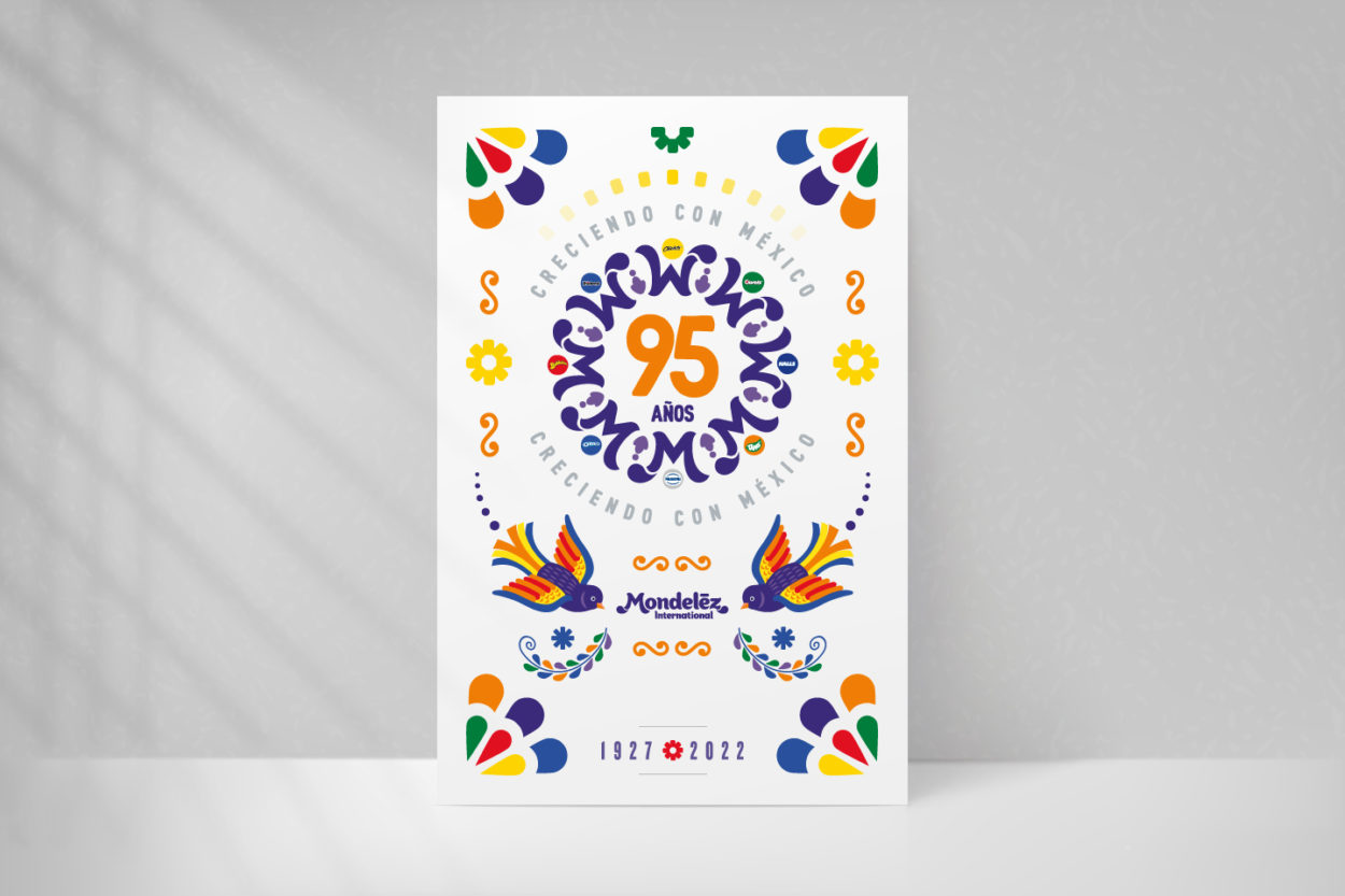
Mondelez 95 Anniversary in Mexico visual identity
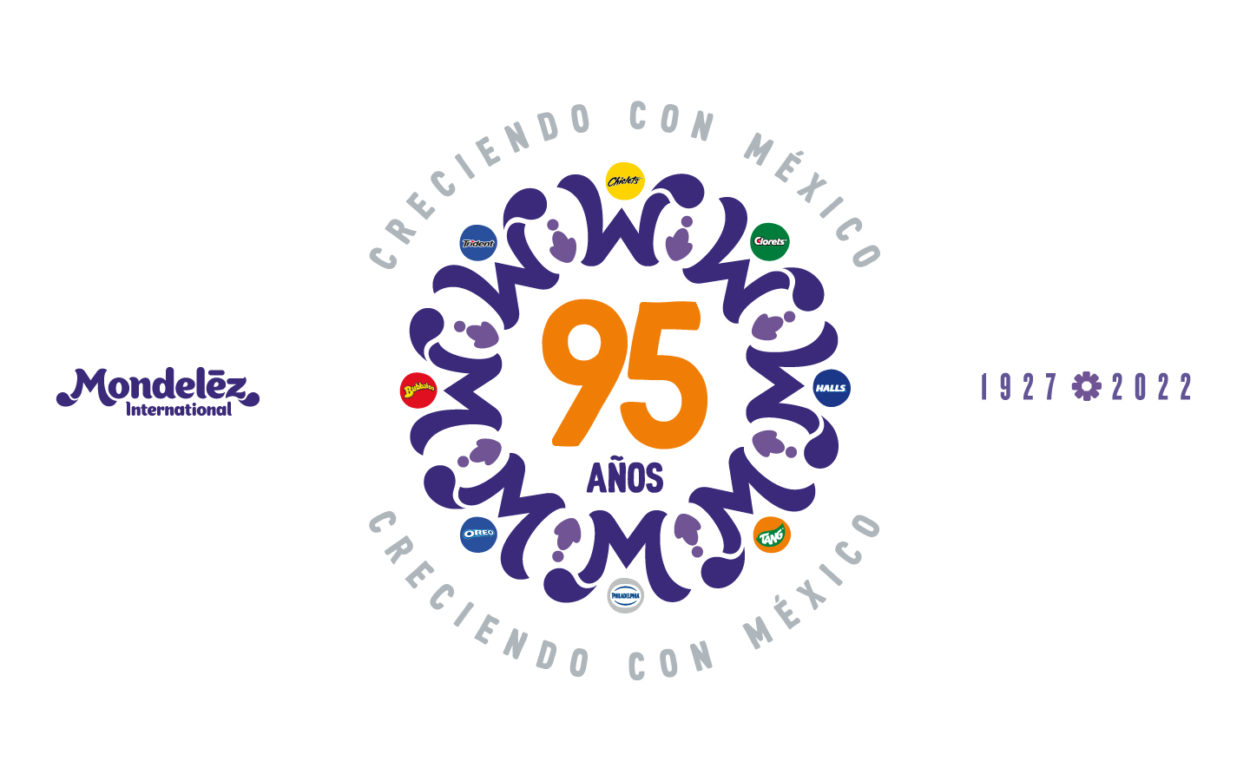
Mondelēz International celebrated its 95th anniversary in Mexico. Its presence dates back to 1927 when Chiclet Adams arrived in the country. To generate a greater sense of belonging to Mexico and pride for the company’s employees, the company sought to create an identity and internal communication system to celebrate this historic moment for Mondelēz International.
The identity had to represent the connection with Mexico, the diversity of its people, the variety of its products, and being a fun company that brings joy to its consumers.
The first approach to the project was to create a series of interviews with some of the Mondelēz communication team members involved in the project who knew the company’s history in Mexico and could give us an informative and, if possible, visual context.
- Identify the company’s leading brands and how they are integrated into the product portfolio in Mexico.
- Research company information in publications, press releases, etc.
- Review the company’s visual brand elements, locally and globally, since this identity had to be aligned with the global brand but with a Mexican feeling.
- Make a list of the products Mondelēz sells in Mexico.
- Review the key brand elements to consider (since this was an identity that had to be approved by the global company): colors, typographies, graphic styles to consider, etc.
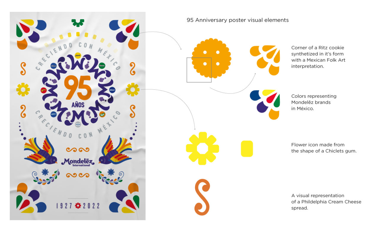
- Research on Mexican graphic elements used in crafts, textiles, art, etc.
- Critical images of some of the products to be used were identified.
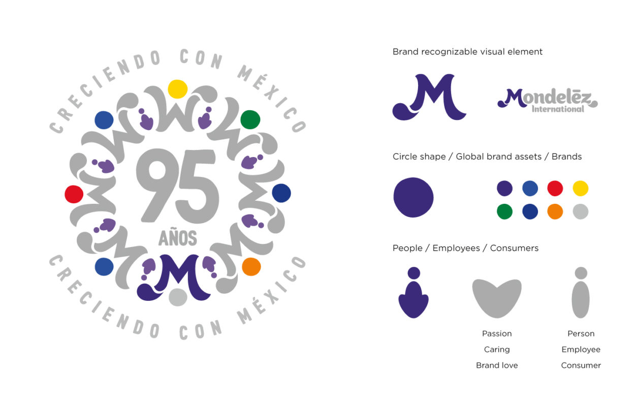
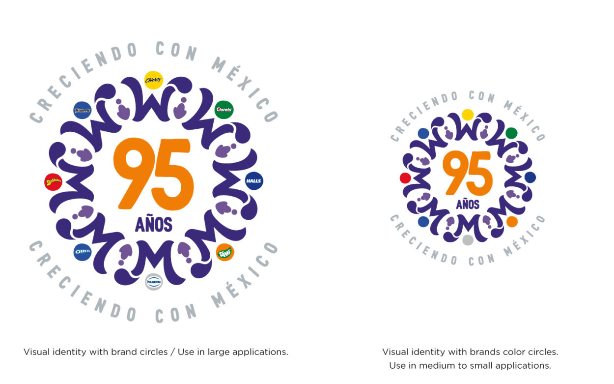
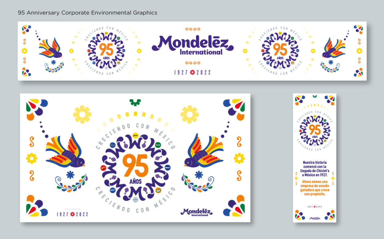
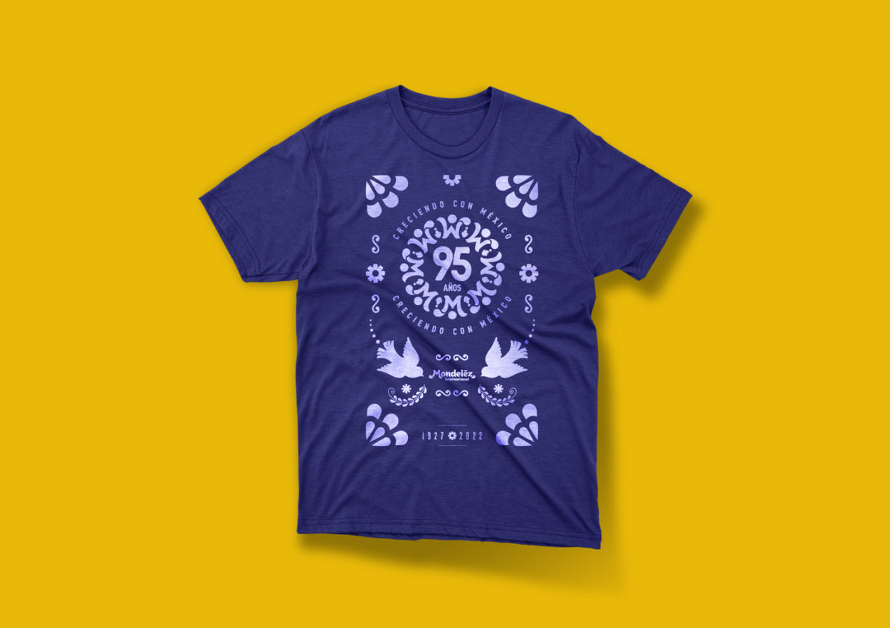
Using the Mondelēz M, an envelope was created to represent a flower and the continuity of a project. This envelope, which covers the number 95, was completed with the graphic synthesis of a figure (representing the Mondelēz people and their passion) and the colored circles representing Mondelēz brands in Mexico. These elements represented the idea of a growing flower (associated with Mexican folk art).
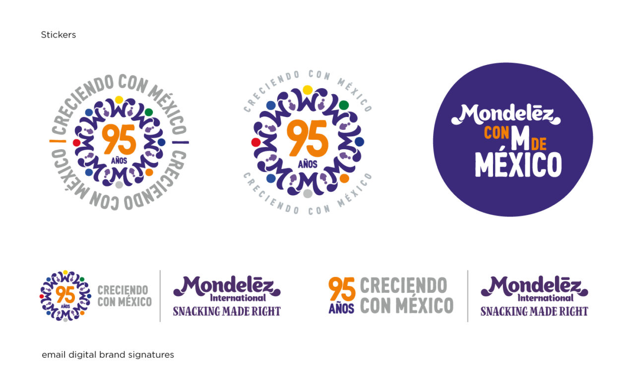
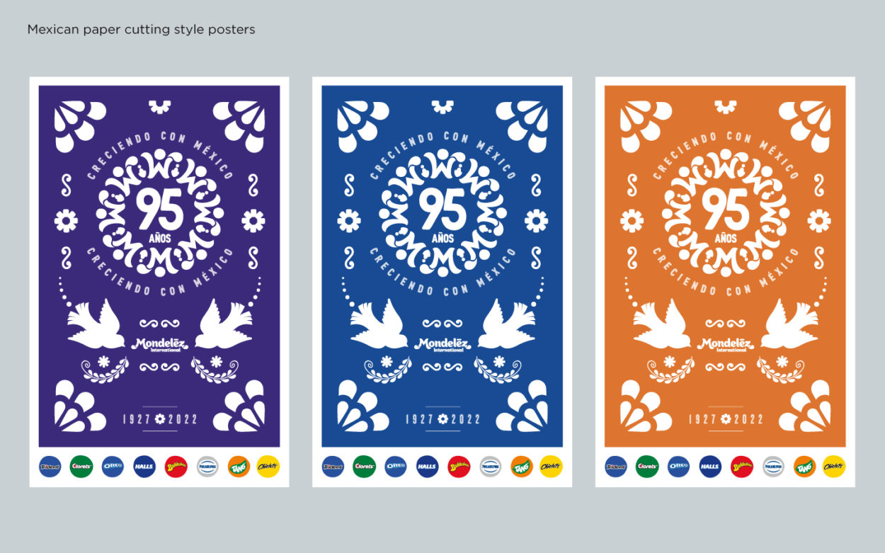
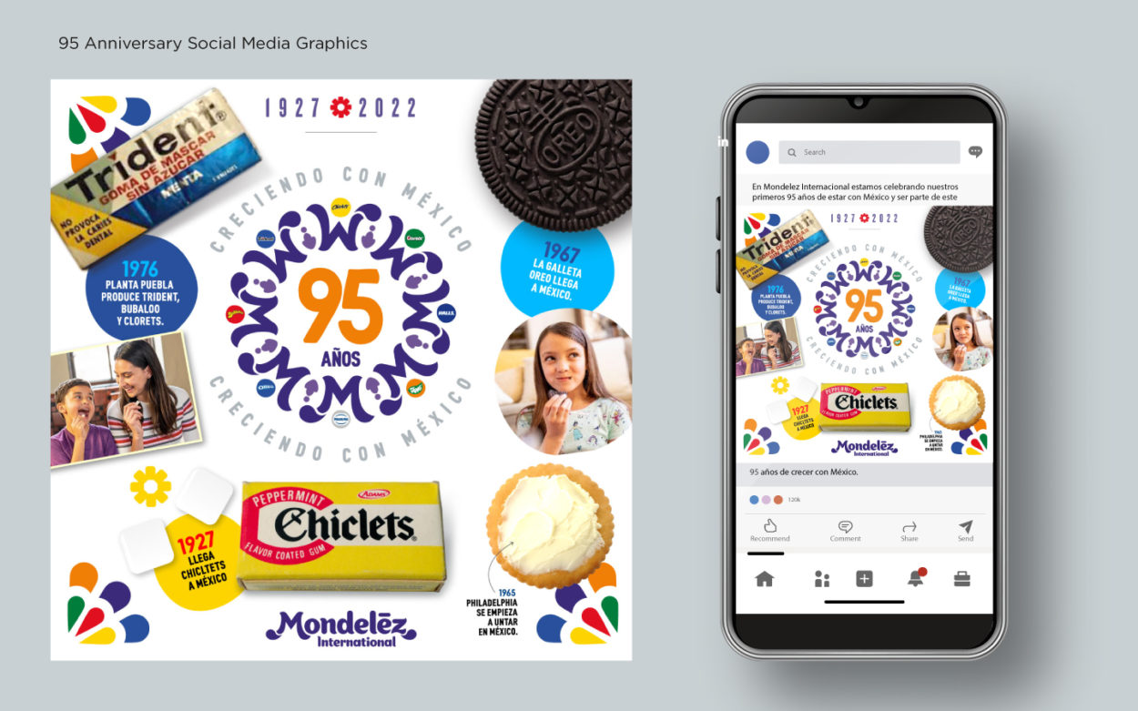
Three versions of the identity were created, one of which would have the brand logos in the colored circles (posters and banners).
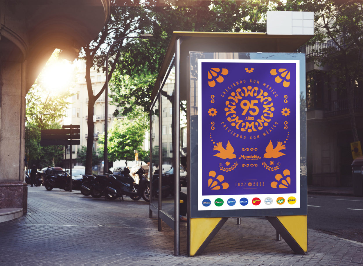
- A series of graphic elements were created that would be applied to a series of communication applications: posters, banners, corporate environmental branding, etc.
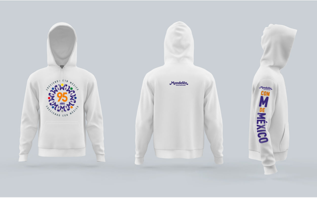
- Applications made: Posters, banners, T-shirts, hoodies, corporate environmental graphics, social media graphics, informational graphics, presentations, etc.
- The visual solution connected with the Mondelēz employees, giving them a sense of pride in the company’s history and its Mexican connection.
From the client
‘The 95th Anniversary visual identity was the milestone that laid the groundwork for the purchase of Ricolino (one of the most recognizable candy company in Mexico which was bought later in 2022). It gave us the credentials not to be questioned -even though we are not of Mexican origin- to buy a brand with such a long tradition”.
From the client
“The identity was aligned with Mondelēz International’s graphic style so it was globally approved, connected with the consumer and generated so much pride inside the company, it was also used in external communication for our press releases, including a cover featuring the President of our company”.
