Communication strategies through data visualization

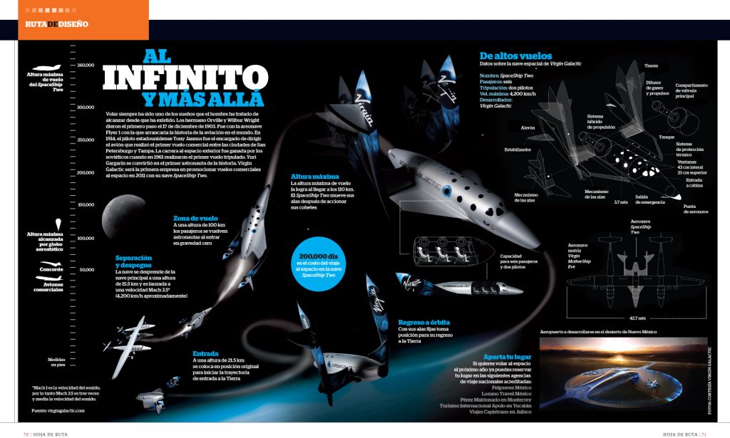
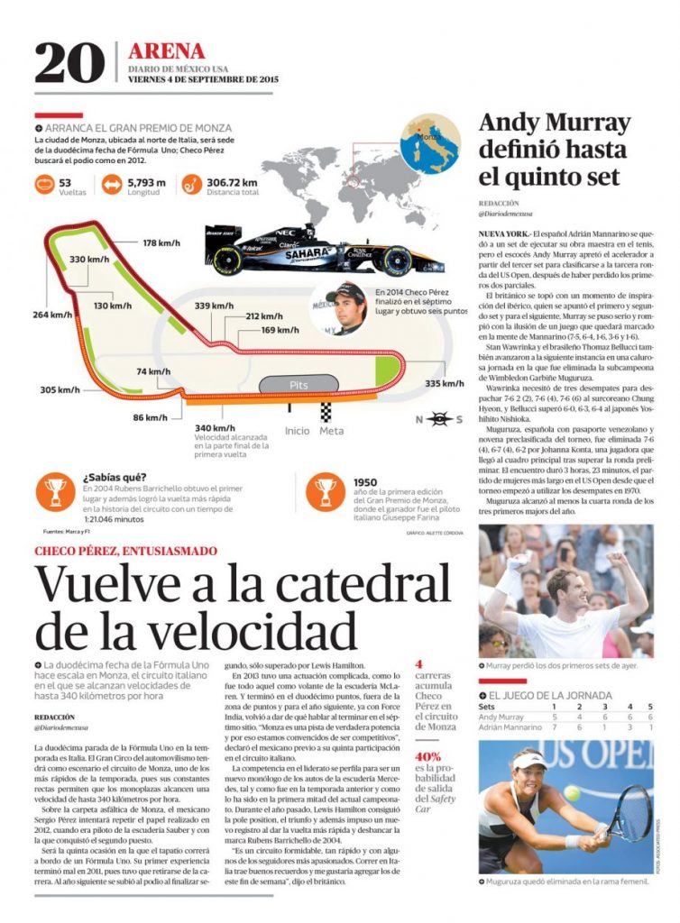
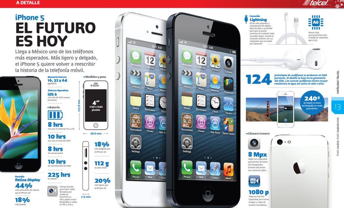
Data visualization can be a powerful, graphic and strategic content communication tool for corporate reports, products, brands, etc., if used wisely (meaning you have to see where and how will it be published, space, readability, print or digital, etc.).
As a visual communication specialist you have to be a reader before anything else. You have to stand in a readers point of view to see how you can empower your content through visual assets (photos, graphics, infographics, charts, etc.).

Knowing you audience is key and it can define the style, voice and tone of your content. A complex graphic can scare your reader (have seen a lot of those), to much data can make a simple message a messy one. Don’t be afraid of pushing the boundaries of what your visual content can do, but always set a limit with some simple rules: readable, effective, simple (yet attractive), engaging, brand aligned and with hierarchy (take your reader from point A to B).

From the type you use to the color scheme, everything can affect your visual content.
Content is king.
Information is your main ingredient and is up to an strategic visual communicator to transform those into a visual appealing and rich flavor savvy dish. Informative graphics can live in small places, they don’t have to always be big.


