
2011 | GRUPO BRACA
DIARIO DE MÉXICO USA (NY EDITION)
Diario de Mexico's transformation also brought about a redesign of the edition created for a resident immigrant audience in New York State. The design of 60%
of the contents was replicated from the Mexican edition, while the remaining 40% focused on sections with the specialized subject matter that the USA edition required. To accomplish that aim, two additional sections (NY and Mi Tierra)
were created to specifically target the NY audiences.


EDICIÓN ANTERIOR
NUEVA EDICIÓN
SCOPE | EDITORIAL REENGINEERING | NEW EDITORIAL TEAM AND WORK PROCESSES
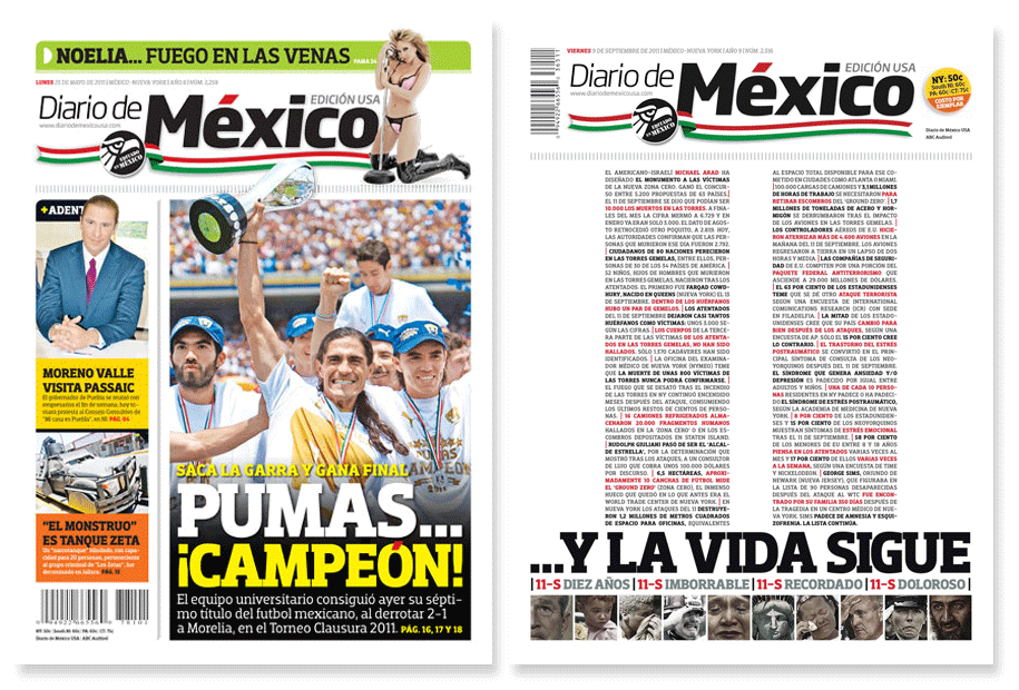
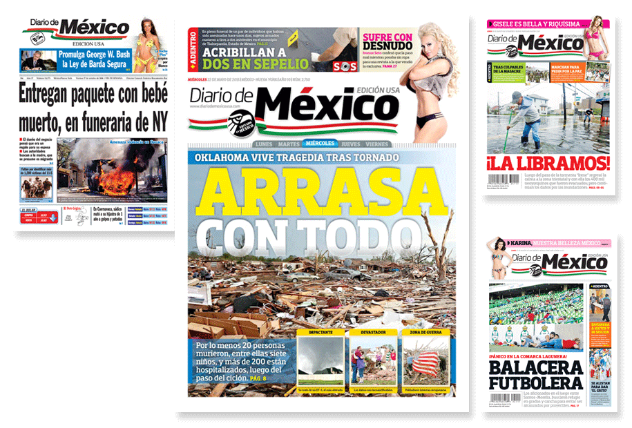
MODULAR DESIGN | THE MODULE-BASED MODEL FACILITATES THE CREATION OF DISPLAY COVERS WHENEVER NECESSARY
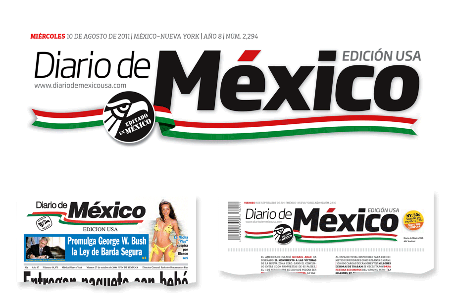
FLAG REDESIGN | WHILE KEEPING ITS ORIGINAL DNA, THE FLAG’S STRUCTURE WAS UPDATED TO STYLIZE AND STRENGHTEN IT.
THE RIBBON WAS MODIFIED, SEEKING TO GENERATE ORGANIC MOVEMENT AND UNIFY ITS ELEMENTS (FLAG AND SEAL)
ANTERIOR
NUEVA
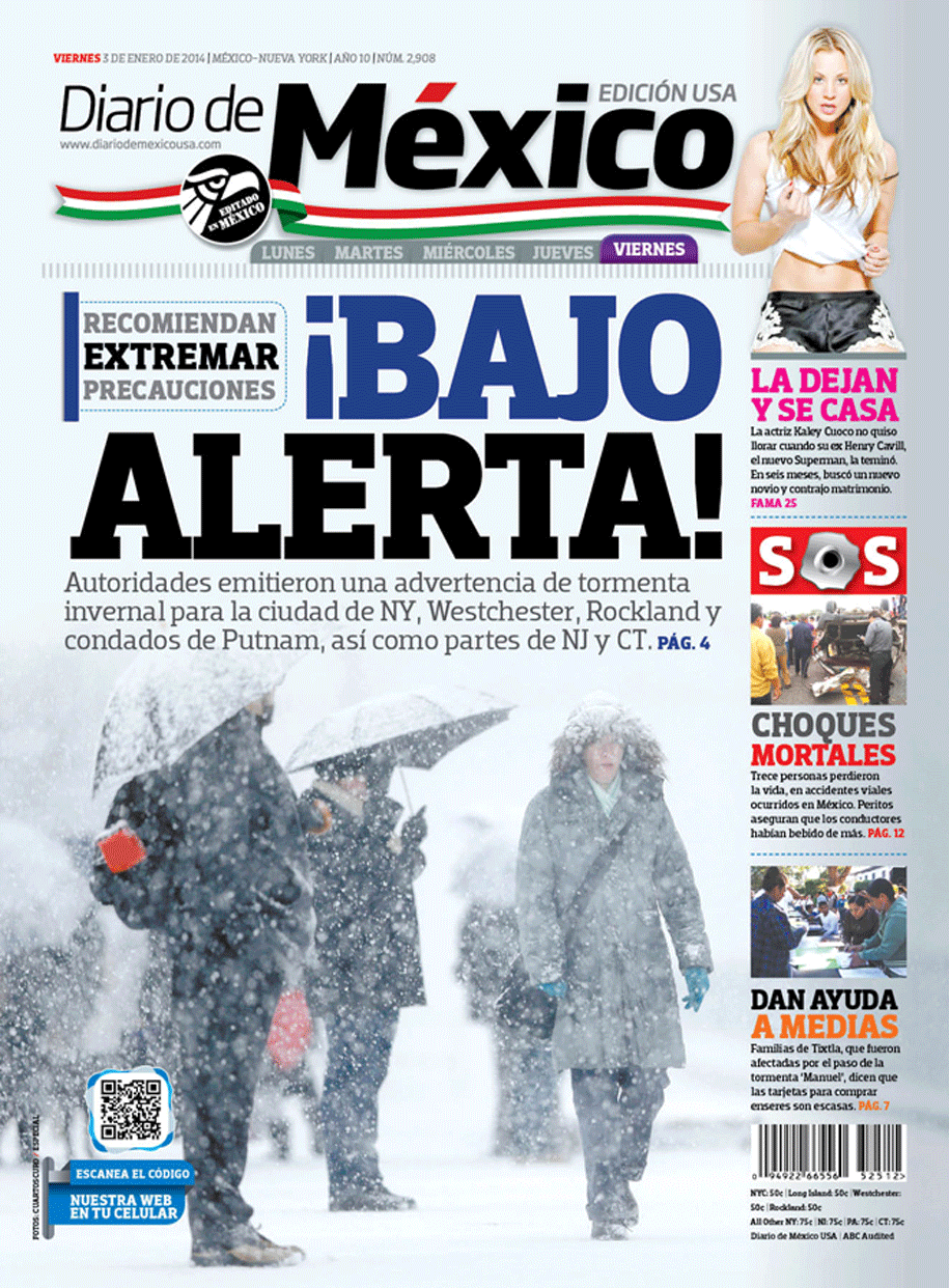
FLAG | ITS REDESIGN ALLOWS DIRECT APPLICATION ON TOP OF IMAGES WITHOUT LOSS OF STRUCTURE
EDITORIAL SYNERGY | 60% OF CONTENTS ARE SHARED WITH THE MEXICO CITY EDITION
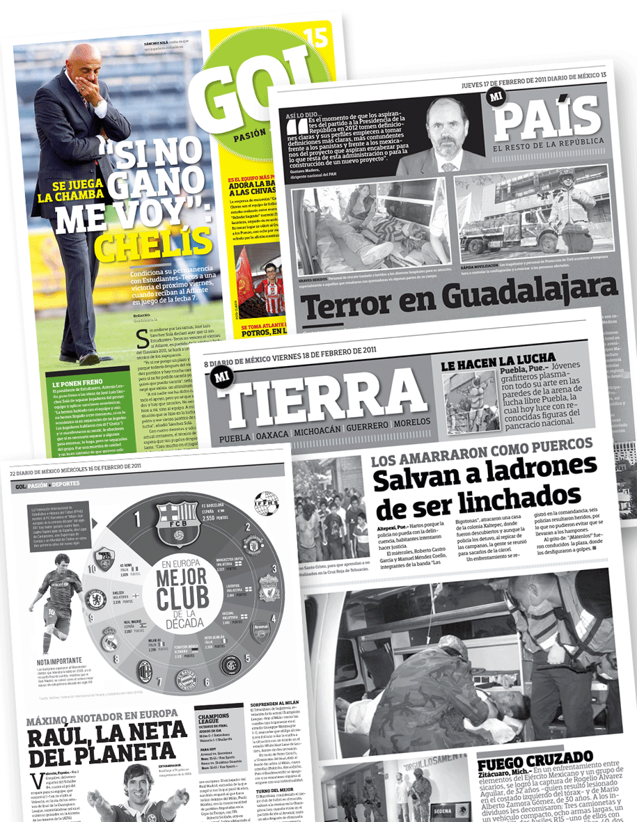
ADDITIONAL ELEMENTS | 40% OF EXTRA MATERIAL IS SPECIFICALLY CREATED FOR NY IMMIGRANT RESIDENTS

PREVIOUS
NEXT

The information, images, and data contained in
this website are copyrighted by DANIEL ESQUEDA MEDIA™ and may not be distributed, modified,
or reproduced in whole or in part.