
PORTAFOLIO
2014 | NÓMADA
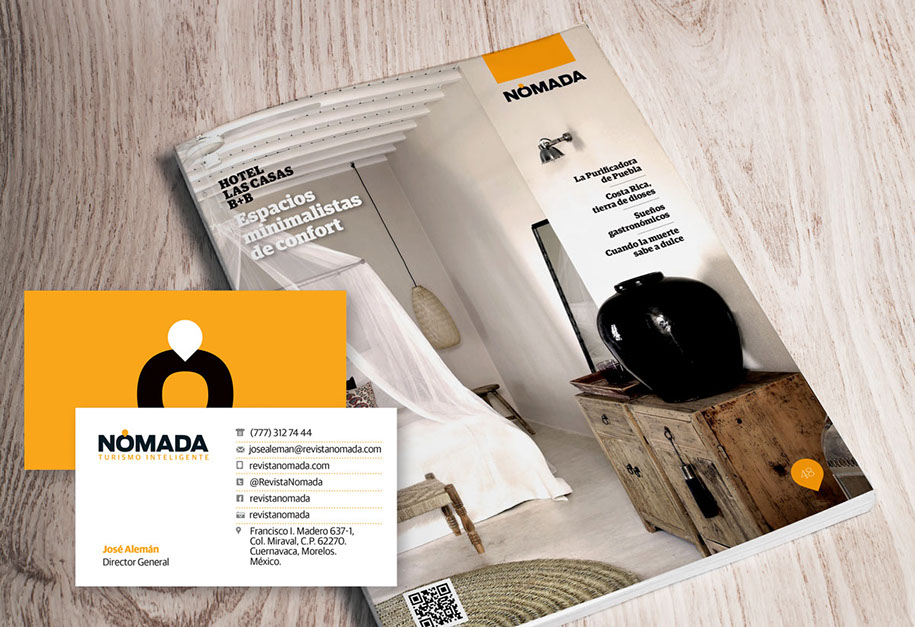
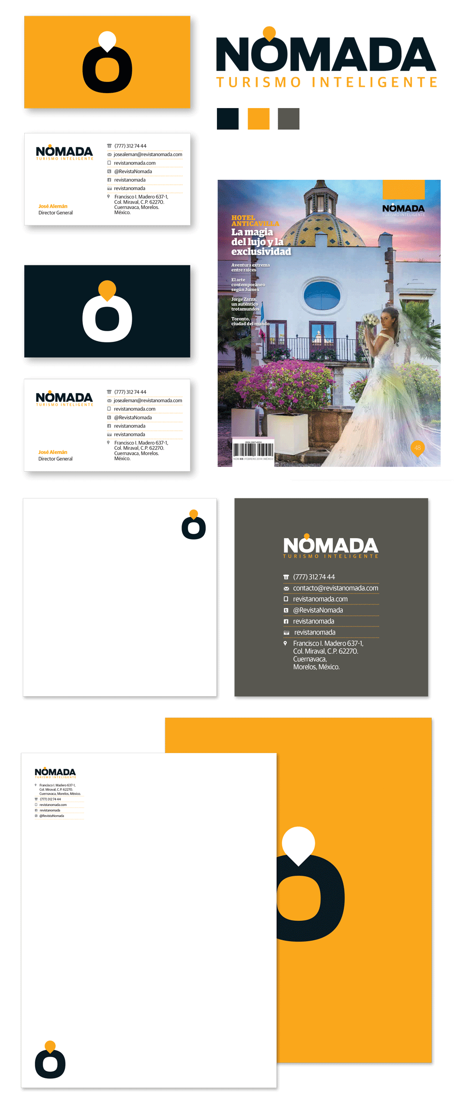
NÓMADA
With the editorial and graphic overhaul of Morelos´ tourism magazine Nomada, the identity of the company behind the project was also modified with new fonts and colors. A location icon was applied as an accent to the Spanish word “Nómada” to be used as a distinctive mark that reflected the company´s (and the magazine´s) philosophy: help readers find places worth knowing.


The information, images, and data contained in
this website are copyrighted by DANIEL ESQUEDA MEDIA™ and may not be distributed, modified,
or reproduced in whole or in part.

PREVIOUS
NEXT